Cross-browser compatibility ensures your website or web app works seamlessly across different browsers and devices, providing a smooth user experience. Here are the top 10 cross-browser issues and their fixes:
-
HTML or CSS Code Errors: Validate your code, check for syntax mistakes, follow best practices, test across browsers, and use browser debugging tools.
-
Unavailable CSS Resets: Use a CSS reset stylesheet like Eric Meyer's Reset CSS, HTML5Reset, or Normalize.css to remove default browser styles.
-
Vendor-Specific Styles: Use standard CSS properties whenever possible, stay updated on browser support, group vendor-prefixed rules together, and consider automation tools.
-
Incompatible Layouts: Implement a CSS reset, define a viewport meta tag, test and refine your design, and leverage CSS frameworks like Bootstrap or Foundation.
-
DOCTYPE Error: Add the correct DOCTYPE declaration at the start of your HTML file (e.g.,
<!DOCTYPE html>for HTML5). -
JavaScript Issues: Use feature detection, libraries and polyfills, transpile modern JavaScript, and thoroughly test on real browsers.
-
Outdated Browser Detection: Use tools like Modernizer, Outdated Browser, or custom solutions to detect and notify users of outdated browsers.
-
Using Untrusted Cross-Browser Libraries and Frameworks: Use well-known, trusted frameworks like Angular JS, React JS, Bootstrap, Animate, and JQuery.
-
Not Using Separate Stylesheets for Different Browsers: Detect the browser using JavaScript and use separate stylesheets or browser-specific CSS hacks/prefixes.
-
Lack of Testing on Real Devices: Use cloud-based testing platforms like BrowserStack, Sauce Labs, or LambdaTest, test on multiple devices and browsers, automate testing, test regularly, and test native device features.
| Tactic | Description |
|---|---|
| Separate Stylesheets | Detect browser and use separate stylesheets or CSS hacks/prefixes |
| Test on Real Devices | Use cloud platforms, test on multiple devices/browsers, automate testing |
| Stay Up-to-Date | Monitor browser updates and continuously test for compatibility |
Related video from YouTube
1. HTML or CSS Code Errors
Description
One of the most common issues with cross-browser compatibility is errors in the HTML or CSS code. These errors can happen when the code is invalid or incorrectly written, causing different browsers to display the website or app differently. For example, a missing closing tag or an incorrect CSS selector can lead to layout problems or styling issues.
Affected Browsers
All browsers can be affected by HTML and CSS code errors, including:
- Google Chrome
- Mozilla Firefox
- Apple Safari
- Microsoft Edge
- And others
Solution
To fix HTML and CSS code errors, follow these steps:
1. Validate your code
Use tools like the W3C HTML Validator and W3C CSS Validator to check your code for errors and warnings.
2. Check for syntax mistakes
Look for common mistakes like:
- Missing closing tags
- Incorrect attribute values
- Typos
3. Follow coding best practices
Use a consistent coding style and follow best practices for writing HTML and CSS code.
4. Test in different browsers
Open your website or app in various browsers and devices to identify any rendering issues.
5. Use browser debugging tools
Tools like Chrome DevTools or Firefox Developer Edition can help you identify and fix errors in your code.
2. Unavailable CSS Resets
Description
Some browsers apply default styles to HTML elements like margins, padding, font sizes, and line heights. These default styles can cause layout and design inconsistencies across different browsers, leading to cross-browser compatibility issues.
Affected Browsers
This issue can affect all major browsers, including:
- Google Chrome
- Mozilla Firefox
- Apple Safari
- Microsoft Edge
Solution
To resolve unavailable CSS resets, follow these steps:
- Use a CSS reset style sheet
Add a CSS reset style sheet to your website to remove the default styles applied by browsers. Popular options include:
| CSS Reset | Description |
|---|---|
| Eric Meyer's Reset CSS | A simple and straightforward reset |
| HTML5Reset | A reset for HTML5-ready browsers |
| Normalize.css | A modern alternative to CSS resets |
- Define your own styles
After resetting the default styles, define your own custom styles for each HTML element to ensure consistency across browsers.
- Test in different browsers
Open your website in various browsers and devices to identify any rendering issues.
- Use browser debugging tools
Tools like Chrome DevTools or Firefox Developer Tools can help you identify and fix issues in your code.
3. Vendor-Specific Styles
Description
Vendor-specific styles refer to CSS properties that use prefixes like -webkit- for WebKit-based browsers (Chrome, Safari), -moz- for Mozilla Firefox, and -ms- for Microsoft Edge. These prefixes are used to support the same CSS property across different browsers, but can lead to inconsistencies in layout and design.
Affected Browsers
This issue affects all major browsers, including:
- Google Chrome
- Mozilla Firefox
- Apple Safari
- Microsoft Edge
Solution
To resolve vendor-specific style issues, follow these steps:
-
Use the standard property whenever possible: Always include the standard, unprefixed property along with the prefixed versions. Browsers that support the standard will use it, reducing code redundancy.
-
Stay updated on browser support: As browsers evolve, regularly review and update your code to remove unnecessary vendor prefixes.
-
Group vendor-prefixed rules together: Keep vendor-prefixed properties together in your CSS for better readability and easier management.
-
Consider automation tools: Explore tools and preprocessors that can automatically generate vendor prefixes for your CSS, reducing manual effort.
| Approach | Description |
|---|---|
| Use standard property | Include the standard, unprefixed property along with prefixed versions. |
| Update prefixes regularly | Review and adjust prefixes as browser support changes. |
| Group prefixed rules | Keep vendor-prefixed properties together for better organization. |
| Automate prefixes | Use tools or preprocessors to automatically generate vendor prefixes. |
4. Incompatible Layouts
Description
Incompatible layouts happen when a website's design and structure look different across various browsers. This issue arises because browsers interpret HTML, CSS, and JavaScript code differently, leading to inconsistent layouts.
Affected Browsers
Incompatible layouts can affect all major browsers, including:
- Google Chrome
- Mozilla Firefox
- Apple Safari
- Microsoft Edge
Solution
To fix incompatible layout issues, follow these steps:
- Use a CSS reset
Implement a CSS reset like Normalize.css or Eric Meyer's Reset CSS. This establishes a consistent starting point for styling across browsers.
- Define a viewport
Use the HTML viewport meta tag to ensure browsers render the layout correctly, especially on mobile devices.
- Test and refine
Thoroughly test your website across different browsers and devices. Refine your design and code to achieve a consistent layout.
- Leverage CSS frameworks
Consider using CSS frameworks like Bootstrap or Foundation. They provide pre-built, browser-compatible layout components.
| Approach | Description |
|---|---|
| CSS Reset | Establishes a consistent baseline for styling across browsers. |
| Viewport Meta Tag | Ensures proper rendering on different devices, especially mobile. |
| Cross-Browser Testing | Identifies and resolves layout inconsistencies through iterative testing. |
| CSS Frameworks | Utilizes pre-built, browser-compatible layout components. |
5. DOCTYPE Error
Description
A DOCTYPE error happens when the HTML document lacks the correct DOCTYPE declaration at the beginning. This declaration tells the browser which version of HTML the document uses, allowing it to render the page properly. Without it, browsers may enter "quirks mode," causing layout issues and inconsistent display across different browsers.
Affected Browsers
All major browsers can be affected by DOCTYPE errors, including:
- Google Chrome
- Mozilla Firefox
- Apple Safari
- Microsoft Edge
Solution
To fix a DOCTYPE error, simply add the correct DOCTYPE declaration at the start of your HTML file. For HTML5, the declaration is:
<!DOCTYPE html>
This straightforward fix ensures your website renders correctly across different browsers and devices.
sbb-itb-8201525
6. JavaScript Issues
Description
JavaScript issues are a common problem that affects how websites and apps work across different browsers. This happens because browsers interpret JavaScript code differently, leading to errors and inconsistent behavior.
Affected Browsers
JavaScript issues can impact all major browsers, including:
- Google Chrome
- Mozilla Firefox
- Apple Safari
- Microsoft Edge
Solution
To fix JavaScript issues, follow these steps:
- Use feature detection: Check if a feature is supported by the browser before running the code.
- Use libraries and polyfills: Utilize popular libraries and polyfills to provide support for features that older browsers lack.
- Transpile modern JavaScript: Convert code using modern JavaScript features into a version that older browsers can understand.
- Test on real browsers: Thoroughly test your website or app on multiple browsers and browser versions to identify and fix JavaScript issues.
| Approach | Description |
|---|---|
| Feature Detection | Check if a feature is supported before running code |
| Libraries and Polyfills | Use tools to provide support for missing features |
| Transpile Code | Convert modern JavaScript to a compatible version |
| Cross-Browser Testing | Test on various browsers to find and fix issues |
7. Outdated Browser Detection
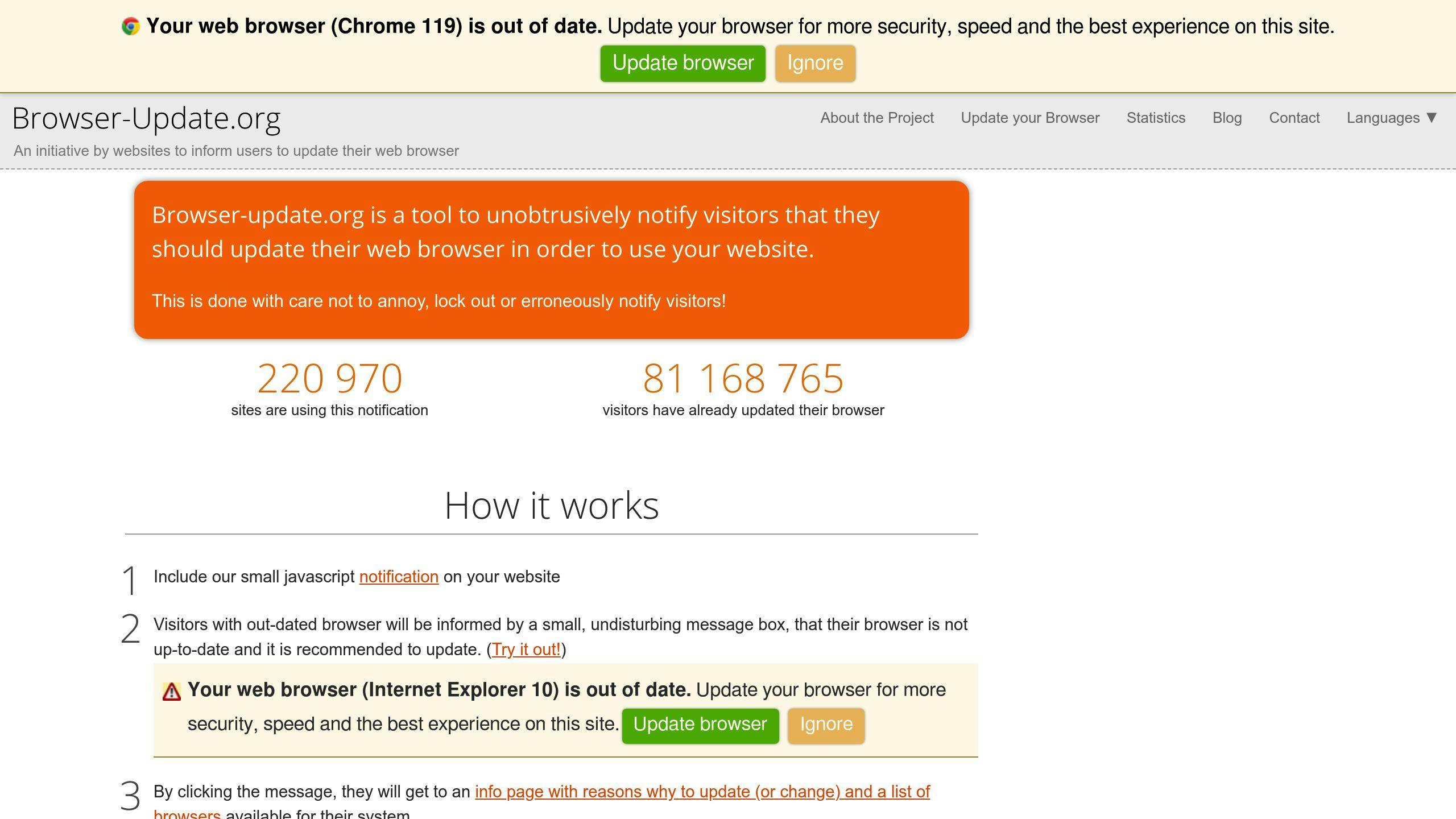
Description
Outdated browser detection helps ensure users can access your website or app's full features. When someone visits using an old browser version, it may not support the latest technologies, leading to a poor experience. Detecting outdated browsers allows you to notify users to update their browser.
Affected Browsers
Outdated browser detection impacts all browsers, including:
- Google Chrome
- Mozilla Firefox
- Apple Safari
- Microsoft Edge
- Internet Explorer
Solution
To detect outdated browsers, you can use:
-
Modernizer: A JavaScript library that checks browser features, focusing on features rather than specific browsers.
-
Outdated Browser tool: A tool that identifies outdated browsers and advises users to upgrade.
-
Custom solutions: Create your own solutions using JavaScript and browser detection libraries to detect outdated browsers and notify users.
| Method | Description |
|---|---|
| Modernizer | Checks browser features, not specific browsers |
| Outdated Browser tool | Detects outdated browsers and recommends upgrading |
| Custom solutions | Use JavaScript and libraries to detect and notify users |
8. Using Untrusted Cross-Browser Libraries and Frameworks
Description
Using unreliable cross-browser libraries and frameworks can cause compatibility issues across different browsers. Features may not work correctly, or frameworks may crash, leading to a poor user experience and impacting your website's performance.
Affected Browsers
This issue can affect all major browsers, including:
- Google Chrome
- Mozilla Firefox
- Apple Safari
- Microsoft Edge
- Internet Explorer
Solution
To avoid these problems, it's crucial to use well-known, trusted frameworks that are compatible across browsers. Here are some examples:
| Framework/Library | Purpose |
|---|---|
| Angular JS, React JS | Web application development |
| Bootstrap, Animate | CSS styling |
| JQuery | JavaScript scripting |
Before using any library or framework, check the documentation for cross-browser compatibility information. This will help ensure a smooth user experience across different browsers.
9. Not Using Separate Stylesheets for Different Browsers
Description
Using a single stylesheet for all browsers can lead to compatibility issues. Different browsers interpret CSS styles differently, resulting in inconsistent layouts, broken designs, and a poor user experience.
Affected Browsers
This issue can impact:
- Google Chrome
- Mozilla Firefox
- Apple Safari
- Microsoft Edge
- Internet Explorer
Solution
To ensure cross-browser compatibility, use separate stylesheets for different browsers. Here's how:
- Detect the browser type using JavaScript
<script type="text/javascript">
  var browser = navigator.appName;
  if (browser == "Microsoft Internet Explorer") {
    document.write("<link type=\"text/css\" rel=\"stylesheet\" href=\"IE.css\">");
  } else if (browser == "Firefox") {
    document.write("<link type=\"text/css\" rel=\"stylesheet\" href=\"FF.css\">");
  } else {
    document.write("<link type=\"text/css\" rel=\"stylesheet\" href=\"generic.css\">");
  }
</script>
- Use browser-specific CSS hacks or prefixes
| Browser | Example |
|---|---|
| Internet Explorer | ```css |
| @media all and (-ms-high-contrast: none), (-ms-high-contrast: active) { | |
| div { |
display: block;
} }
| Mozilla Firefox | ```css
@-moz-document url-prefix() {
  div {
    display: block;
  }
}
``` |

This approach allows you to target specific browsers with custom CSS styles, ensuring a consistent layout and design across different browsers.
10. Lack of Testing on Real Devices
Description
Testing your website or app only on simulated environments can lead to compatibility issues when accessed on real devices. Different browsers, operating systems, and hardware configurations can impact how your site or app functions and appears.
Affected Browsers
This issue can impact all major browsers, including:
- Google Chrome
- Mozilla Firefox
- Apple Safari
- Microsoft Edge
- Internet Explorer
Solution
To ensure your website or app works seamlessly across various devices and browsers, it's crucial to test on real devices. Here's how:
- Use Cloud-Based Testing Platforms
Services like BrowserStack, Sauce Labs, or LambdaTest provide access to a wide range of real devices and browsers. This allows you to test your site or app in a realistic environment.
| Platform | Description |
|---|---|
| BrowserStack | Access to over 2,000 real devices and browsers |
| Sauce Labs | Test on real devices, emulators, and simulators |
| LambdaTest | Test on 3,000+ real browsers and devices |
- Test on Multiple Devices and Browsers
Don't rely on testing on just one device or browser. Test your site or app on various combinations of devices, browsers, and operating systems to catch any compatibility issues.
- Automate Testing
Use automated testing tools to streamline the testing process and ensure consistent, thorough testing across different environments.
- Perform Regular Testing
Test your site or app regularly, not just during initial development. This helps catch compatibility issues early, before they impact users.
- Test Native Device Features
Testing on real devices allows you to verify that your site or app works correctly with native device features like cameras, GPS, and sensors.
Making Your Website Work Across Browsers
To ensure your website works smoothly for all users, it's crucial to address cross-browser compatibility issues. Here are some key steps to take:
Use Separate Stylesheets for Different Browsers
Browsers interpret CSS styles differently, so using separate stylesheets can prevent layout and design issues. Here's how:
- Detect the browser using JavaScript
<script type="text/javascript">
  var browser = navigator.appName;
  if (browser == "Microsoft Internet Explorer") {
    document.write("<link type=\"text/css\" rel=\"stylesheet\" href=\"IE.css\">");
  } else if (browser == "Firefox") {
    document.write("<link type=\"text/css\" rel=\"stylesheet\" href=\"FF.css\">");
  } else {
    document.write("<link type=\"text/css\" rel=\"stylesheet\" href=\"generic.css\">");
  }
</script>
- Use browser-specific CSS hacks or prefixes
| Browser | Example |
|---|---|
| Internet Explorer | ```css |
| @media all and (-ms-high-contrast: none), (-ms-high-contrast: active) { | |
| div { |
display: block;
} }
| Mozilla Firefox | ```css
@-moz-document url-prefix() {
  div {
    display: block;
  }
}
``` |

### Test on Real Devices and Browsers

Testing only on simulated environments can miss compatibility issues on real devices. Test your site on:

- **Cloud-Based Testing Platforms**

| Platform | Description |
| --- | --- |
| BrowserStack | Access over 2,000 real devices and browsers |
| Sauce Labs | Test on real devices, emulators, and simulators |
| LambdaTest | Test on 3,000+ real browsers and devices |

- **Multiple Devices and Browsers**: Test on various combinations to catch issues.
- **Automate Testing**: Use tools to streamline testing across environments.
- **Test Regularly**: Test often, not just during initial development.
- **Test Native Device Features**: Verify your site works with cameras, GPS, and sensors.

### Stay Up-to-Date and Monitor Compatibility

- Keep track of browser updates and changes that may impact your site.
- Continuously monitor and test your site to ensure ongoing compatibility.
